Concept, design and development
of the new UNDPLUS website.
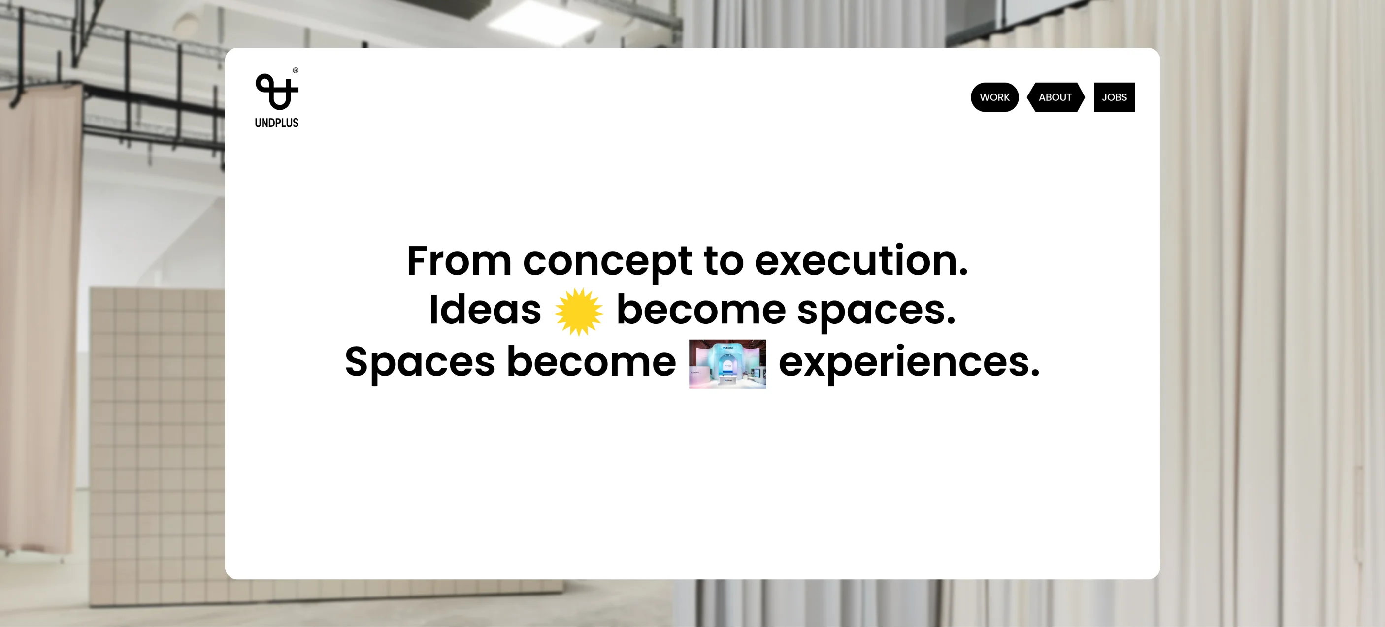
UNDPLUS creates spaces where brands and people come together — brand architecture, spatial design and live experiences from Berlin and Munich. For its tenth anniversary, the studio wanted a website that finally feels the way its work does.
Together with henne.studio, we took the project from concept through design to development: a bold system of colour, oversized type and playful shapes that turns the studio’s attitude into something you can see and click through.
The new site puts fresh work and stories centre stage — and has been nominated on Awwwards.
“Turning what UNDPLUS has always felt like into a digital experience you can finally see and click through.”
The website in nine clips
Move the cursor over a clip to play it.Tap a clip to play it.
Start screen: one line, many disciplines
UNDPLUS works across many disciplines, and a single fixed tagline would have left most of them out. So the line changes: below the oversized wordmark, “UNDPLUS Studio for …” keeps ending differently — pop-ups, retail, brand experiences.
Claim: proof inside the sentence
“Ideas become spaces. Spaces become experiences.” is easy to write and hard to believe. We placed changing shapes and real project photos inside the sentence, so the claim proves itself while you read it.
Featured projects without a grid
In a grid of thumbnails, spatial projects all look the same. Under “Work done” the images tilt, overlap and drift apart while scrolling — closer to walking past the work than to reading a list.
Project overview: filter by discipline
Whoever plans a trade fair booth does not want to scroll through restaurants. The complete archive is a calm grid that re-sorts with one click on a discipline, each filter marked by its own coloured shape.
Services: seven lines, seven moods
Service lists are the part of a studio website nobody reads. Here every line the cursor touches recolours the whole page and puts a new shape behind the list — reason enough to go through all seven.
360° full service — or just a part of it
“Full service” can sound like all or nothing. The line “or just the degree you need” takes that pressure away, and a rolling band of shapes shows the steps from the first spark to the finishing touches.
About: the studio in short statements
After ten years there is a lot to tell, and long about pages lose their readers. Large statements, the team and project images take turns, so the page stays in motion to the end.
Contact as a poster
A contact form at the end of a page is easy to overlook. We turned the invitation into a poster: heavy letters, a star in place of the O and a wave rolling along the bottom edge.
A footer that still plays along
Attention usually ends at the footer. Here running bands of social links frame a short introduction, and the “Learn more” link grows a different shape every time the cursor comes by.