A new corporate identity for the PRÄZI Group,
a European manufacturer of precision flat steel.
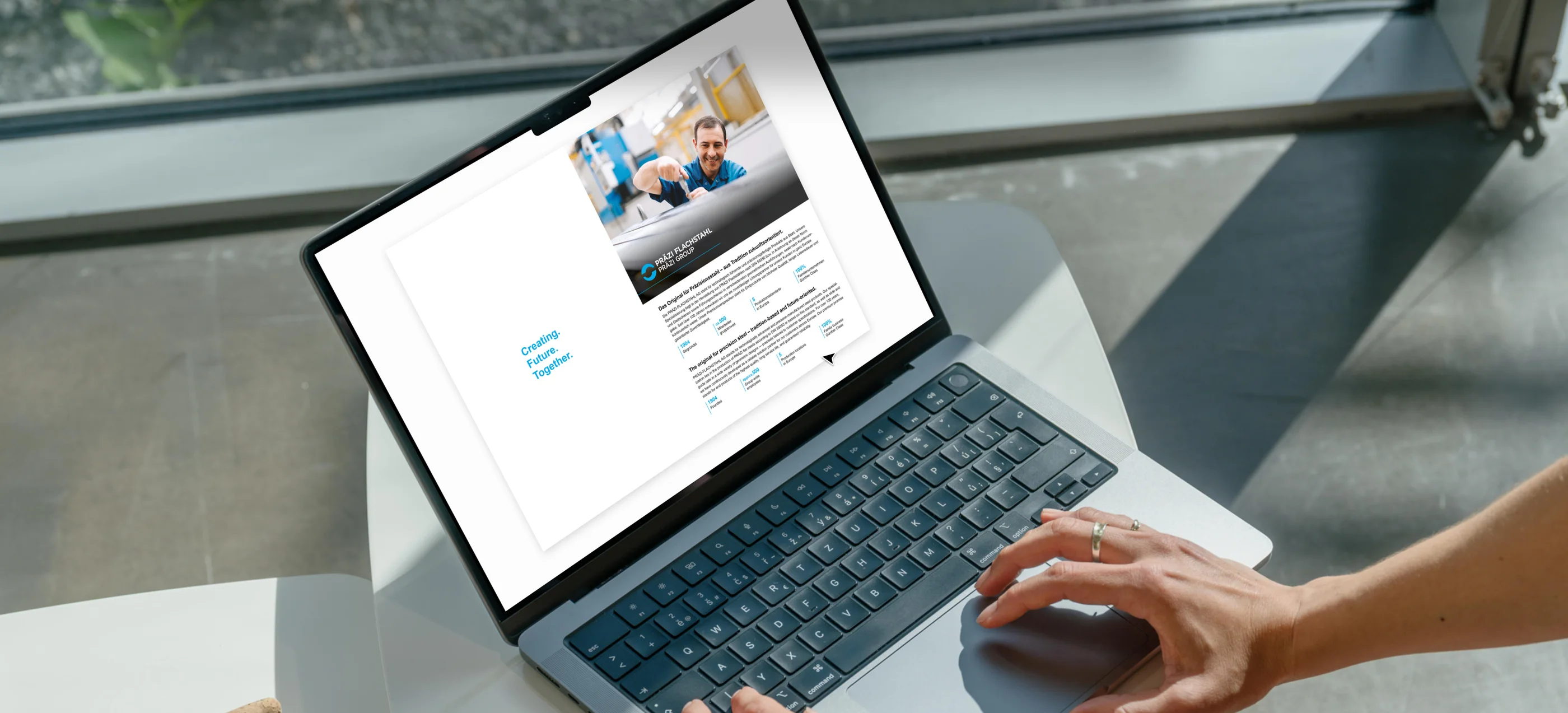
For the PRÄZI Group — a leading flat steel manufacturer with more than 500 employees at four European locations — we redefined the company’s entire corporate identity.
From redesigning the logo to rolling out the new visual language across various media — including business cards, flyers, stationery and the website — we gave the international brand a bold and consistent visual presence.
The new CI is flexible across all touchpoints and positions PRÄZI with a fresh, modern, and innovative image in the flat steel manufacturing market.
More than 500 employees, six companies, four locations — and now one shared visual identity.
Seven tasks, seven solutions

One brand mark for six companies
Six companies in one group have to be recognisable as a family and still be told apart. The solution is one shared brand mark with the company name beside it — each logo in colour, black and negative, with colours defined for CMYK, Pantone and RGB.
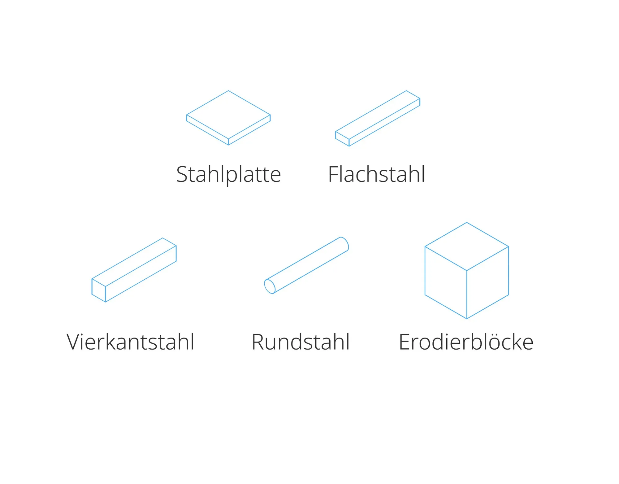
Icons for products that look alike
In a photo, a steel plate and a piece of flat steel are hard to tell apart. Simple line drawings in the brand blue make each product form recognisable at a glance — in print as well as on screen.

One business card layout for the whole group
Employees of different companies and countries should hand over the same kind of card. One layout does it: the logo alone on one side, name and contact details with three small icons on the other — only the logo changes.

A flyer that shows the people behind the steel
Precision steel is a technical product and hard to make tangible. The flyer for PRÄZI Flachstahl therefore leads with large photos from production, short headlines and the three values the company stands for.

A brochure that introduces the whole group
Many customers know one of the companies, but not the group behind it. Under the line “One Group. Many Strengths.” the brochure introduces all of them in German and English and shows their locations on a map.

A catalogue for hundreds of values
A steel catalogue consists of dimensions and prices — hundreds per material. Every material gets a data sheet in two languages, followed by tables with a calm rhythm that remain readable down to the last column.
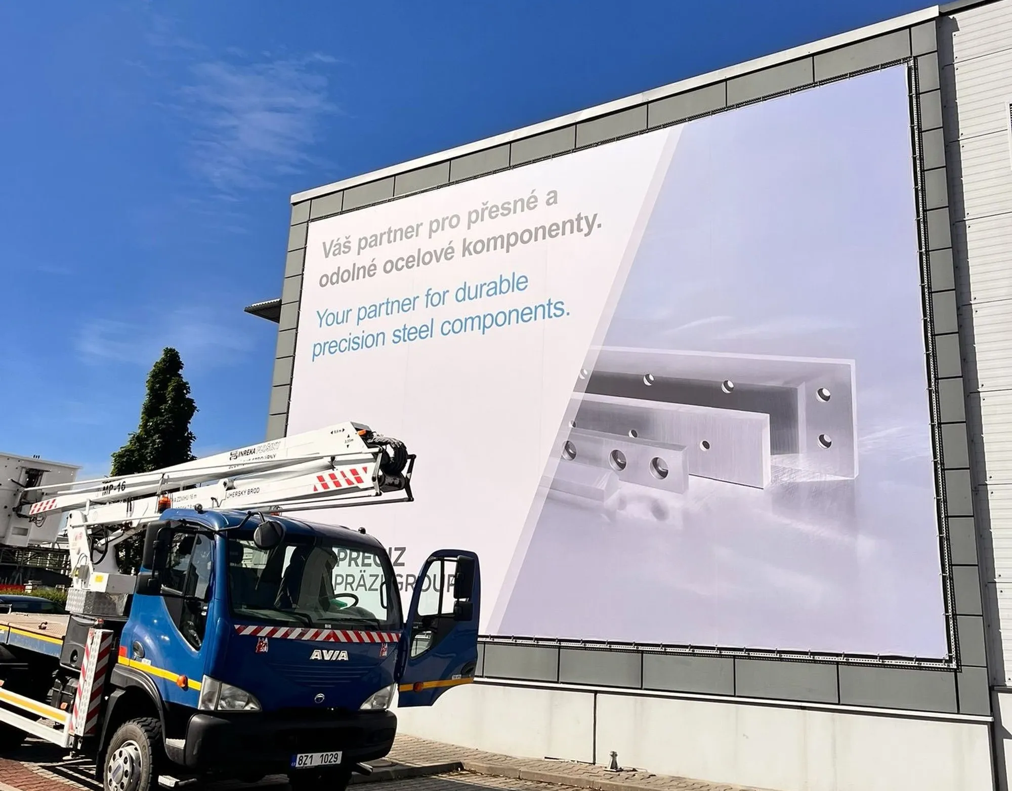
The identity at building size
A corporate identity has to hold up far beyond paper formats. On the facade of the PRECIZ site, the same typography and imagery carry a banner in Czech and English: “Your partner for durable precision steel components.”